Data visualization software is key to representing your data in the right way.
When it comes to creating presentations, charts, maps, videos, and other representations, data visualization tools can be a key part of communicating your results concisely.
Table of Contents
Data visualization overview
We are naturally drawn to visual images. For example, when we see a chart or image in an article, we naturally stop to look at it.
Over 90 percent of the information our brains process is visual.
Businesses have found that integrating data visualization and analytics has produced an ROI of 15x on each dollar spent.
4 in 5 CEOs and COOs believe that companies need to embrace big data in order to derive insights about their industry.
If you’re looking to implement data visualization for your business, then you’re in the right place.
The visual representation of data is an important part of conveying a message easily and quickly.
Let’s take a look at the best data visualization software.
Best Data Visualization Software
#1 Tableau
Tableau is well-known as a popular data visualization software. It’s intuitive drag-and-drop interface makes it easy to create data visualizations.
It offers features such as the ability to connect to multiple data sources, create custom dashboards, and use data filters.
Tableau data visualization is a great option if you’re looking for data visualization software that is easy to use and has a lot of features.
Pricing:
Tableau’s pricing plans start from $15 per user/month and range up to $70 per user/month.
Tableau data visualization
Tableau software is one of the most popular data visualization tools available. It offers a wide range of features that make it easy to create beautiful and interactive data visualizations.
Tableau is a powerful tool that helps businesses see and understand their data. With Tableau, businesses can easily create charts, graphs, and maps that reveal trends and insights. Tableau is an essential tool for data visualization.
About Tableau Public Data Visualization
Tableau Public is a free data visualization tool that anyone can use. It offers a wide range of features that make it easy to create beautiful and interactive data visualizations.
Tableau Public is a powerful tool that helps people see and understand their data. With Tableau Public, people can easily create charts, graphs, and maps that reveal trends and insights. Tableau Public is an essential tool for data visualization.
Some of the most popular data visualization techniques include using charts, graphs, and maps to reveal trends and insights.
Tableau visualization examples
Some of the most popular data visualization techniques include using charts, graphs, and maps to reveal trends and insights. These techniques are used to present quantitative data in a way that is easy to understand. Data visualizations can also reveal patterns that would be difficult to spot otherwise.
When done well, data visualizations can make complex concepts easier to understand. They can also tell stories that engage the audience and highlight the key takeaways. Tableau is a powerful tool that businesses can use to make better decisions, improve communication, and tell stories.


(Source: Tableau Data Visualization Software)
Tableau for Data Science and Data Visualization – Crash Course Tutorial
#2 Zoho Analytics
Zoho Analytics is a popular business intelligence (BI) tool where you can upload your data in a secure manner and have various tools to help tell the data’s story.
This includes:
- charts
- tables
- graphs, and
- other ways to graphically represent your data
Its Augment Analytics feature enable machine learning algorithms to uncover insights about your data without doing any manual work yourself.
Pricing:
Zoho Analytics pricing starts at $24 per month and can go up to $455 per month. It comes with a 15-day free trial to see if it’s right for you.
#3 Chartblocks
ChartBlocks is a data visualization software that enables you to import your data quickly and update your data instantly within the ChartBlock app.
Most data analysis can be time-consuming in terms of finding data, editing it, running commands to analyze it, and designing and labeling charts.
Chartblocks helps clear a lot of that up so you can analyze and present data quickly.
Pricing:
The plan is free at first, where you get up to 50 active charts. After that, the paid plans start from $20 per month.
#4 Infogram
Infogram is a web-based data visualization software, which makes it easy to use.
You can make infographics, charts, and graphs and publish them wherever you’d like.
Infogram also involves little coding or technical know-how, so it’s easy for non-technical users who want to use data visualization tools.
Pricing:
Infogram follows a freemium model.
The paid plans start at $19 per month and goes up to $149 per month.
There’s also a custom plan where you can get all the features you want based on your specific requirements.
#5 Plotly
Plotly is known not only for data visualization but its analytical reports that help you keep track of the data.
Plotly has enterprise products such as Dash Enterprise and Chart Studio Enterprise.
So Plotly is best suited for organizations that require data science and AI on a mass scale.
Pricing:
There is a basic free plan, with paid plans starting at $59 per month.
#6 Datawrapper
Have you noticed that some charts and graphs are almost impossible to read no matter your device?
This is where Datawrapper comes in.
All the charts, graphs, maps, and tables you create with DataWrapper are easily readable on all devices. The good news is that you don’t need any coding skills to create the charts.
Pricing:
It’s open-source and free. You can also export your graphs and charts into .png format for free.
There are paid plans that start at €499 per month.
#7 Databox
Databox is data visualization software that’s great for creating custom dashboards.
You can choose from a variety of data visualization templates and then customize them to your liking.
The best part is that you can share the data visualizations with anyone, even if they don’t have Databox.
Some good features include:
- 200+ pre-installed reports that work with your CRM, Google Ads, Google Analytics, email performance, and marketing software.
- More than 70 integrations that connect easily with software like Mailchimp, Facebook Ads, Shopify, HubSpot, Salesforce, and more.
- Advanced data calculations from multiple sources, such as marketing metrics like LTV, ROAS, ARPU, LTV:CAC, and more.
Pricing:
Their paid plans range from $49/month to $248/month.Choosing the Right Data Visualization Software for You
#8 Google Charts
Google Charts is a data visualization tool that’s part of the larger Google Docs suite.
You can use it to create line charts, bar charts, pie charts, histograms, and other types of data visualizations.
One of the best things about Google Charts is that it’s free to use.
Pricing:
It’s free.
#9 Tableau Public
Tableau Public is data visualization software that’s great for creating interactive data visualizations.
The visualizations you create with Tableau Public can be embedded on websites and blogs.
Tableau Public is free to use, but there are some limitations. For example, the data you use must be publicly available.
Pricing:
It’s free.
#10 QlikView
QlikView is data visualization software that’s great for creating data-driven visualizations.
With QlikView, you can create visually appealing data visualizations that tell a story.
QlikView also has a drag-and-drop interface that makes it easy to use, even if you don’t have any coding skills.
Pricing:
There is a free trial available. After that, the pricing plans start at $89 per month for small businesses.
#11 Power BI
Power BI is data visualization software that’s part of the Microsoft Power platform.
With Power BI, you can create data visualizations that are interactive and informative.
Power BI also has a free version that you can use to get started.
Pricing:
There is a free version available. After that, the pricing plans start at $10 per user per month.
#12 D3.js
D3.js is data visualization software that’s great for creating data-driven visualizations.
With D3.js, you can create data visualizations that are interactive and informative.
It is a powerful, yet easy-to-use JavaScript library that allows you to play with and bring life to documents based on data using HTML, CSS, and SVG. There are a lot of good resources available online to learn D3.js.
D3.js also has a free version that you can use to get started.
Pricing:
There is a free version available. After that, the pricing plans start at $7 per user per month.
#13 FusionCharts
FusionCharts is data visualization software that’s great for creating data-driven visualizations.
It has over 90 chart types that you can use to create data visualizations.
Some of the features include:
- Drill-down capabilities
- Export to PDF, PNG, JPEG, SVG, or JSON formats
- A wide range of data sources including CSV, XML, and JSON
Pricing:
FusionCharts pricing starts at $199.00 per feature, per month. There is a free version. FusionCharts offers a free trial.
#14 Chartio
Chartio is data visualization software that’s great for creating data-driven visualizations.
With Chartio, you can connect to any data source, including MySQL, PostgreSQL, MongoDB, Amazon Redshift, Google BigQuery, and more.
Chartio also has a drag-and-drop interface that makes it easy to use, even if you don’t have any coding skills.
Pricing:
There is a free version available. After that, the pricing plans start at $49 per user per month.
#15 Visually
Visually is best for marketers who need to visualize data and generate infographics. It comes with convenient social integration features.
Visually is best suited for larger firms.
Pricing:
Pricing depends on the number of users. It comes with a free trial but there is no free version if you want to use it going forward.
#16 Grafana
Grafana is data visualization software that’s great for creating data-driven visualizations.
With Grafana, you can create data visualizations that are interactive and informative.
Grafana also has a free version that you can use to get started.
Pricing:
An Amazon Managed Grafana Editor license costs $9 per active editor or administrator user per workspace and provides the user with administrative permissions
#17 Ember Charts
The Ember Charts is a charting library database built with the Ember.js and d3.js frameworks.
If your organization needs statistical charts on a regular basis, then Ember Charts could be a great fit.
Pricing:
It’s a free tool and there are no associated costs.
#18 NVD3
NVD3 is reusable charts for D3.js with a high level of customizability.
Pricing:
NVD3 is a free data visualization tool.
#19 R Studio
R Studio is data visualization software that’s great for creating data-driven visualizations.
With R Studio, you can create data visualizations that are interactive and informative.
R, of course, is one of the most popular statistical computing software in the world.
Pricing:
R Studio is free.
#20 RAWGraphs
RAWGraphs allows you to export visualizations as vector (SVG) or raster (PNG) images.
Pricing:
RAWGraphs is free data visualization software.
#21 Chart.js
Chart.js is a flexible visualization tool primarily built for designers and developers. An open community maintains it, so it’s free of cost.
Pricing:
Chart.js is a free data visualization platform.
#22 Leaflet
Leaflet is for map creation and data visualization. It’s open-source and has community support, so it doesn’t have a cost.
Leaflet uses OpenStreetMap data. This enables you to add HTML5/CSS3 interactivity and visualizations.
It doesn’t allow for pie charts and other types of data visualizations that come with other tools.
Pricing:
Leaflet is free data visualization software.

Define Data Visualization
Data visualization is the visual representation of data in a pictorial or graphical format. It enables decision makers to see analytics presented visually, so they can grasp difficult concepts or identify new patterns.
With interactive data visualization, users can explore data and avoid bias in their interpretation.
Data visualization techniques include using charts, graphs, and maps to reveal trends and insights.
While data visualization has been around for centuries, the term “data visualization” only became popular in the early 2010s.
With the rise of big data, there was a need for ways to effectively communicate large amounts of data.
Data visualization has since become an essential tool for businesses and organizations of all sizes.
Why is Data Visualization Important?
Data visualization is important because it helps people understand data. By presenting data in a visual format, businesses can make better decisions, identify new opportunities, and improve communication.
Data visualization is also important for storytelling. A good data visualization can tell a story that engages the audience and highlights the key takeaways. When done well, data visualizations can be both informative and visually appealing.
What is Data Visualization Software?
Data Visualization Software is the process of turning data and information into visual, graphical formats.
Data visualization tools provide elements such as graphs, charts, and maps to better observe and understand trends, patterns, and outliers in data.
What is data visualization in 3 minutes?
Choosing the Best Data Visualization Software
Data visualization is a powerful way to communicate data-driven stories. But with so many data visualization tools on the market, it can be hard to know which one is right for you.
Now that we’ve looked at some of the best data visualization software, it’s time to choose the right one for you. Consider your needs and budget when making your decision.
Tableau and Zoho Analytics are great for data visualization on a budget.
If you’re looking for data visualization software with more features, then consider Databox or Infogram.
And if you need data visualization software for a large organization, then Plotly or Datawrapper would be a good choice.
When choosing data visualization software, consider your needs and budget. If you’re just getting started, there are plenty of data visualization tools that are free to use, such as Google Charts and Tableau Public.
But if you need data visualization software with more features, then you’ll need to pay for a subscription.
Whichever data visualization tool you choose, make sure it’s the right fit for your needs.

How Do You Use Data Visualization Tools?
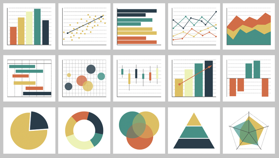
There are lots of different charts and analysis methods in data visualization.
#1 Bar charts
Bar charts are one of the most common data visualization tools. They are used to show comparisons between data sets.
For example, you could use a bar chart to compare the sales of two products.
#2 Pie charts
Pie charts are data visualization tools that are used to show proportions.
For example, you could use a pie chart to show the market share of different products.
#3 Line charts
Line charts are data visualization tools that are used to show trends over time.
For example, you could use a line chart to show the sales of a product over time.
#4 Scatter plots
Scatter plots are data visualization tools that are used to show relationships between data sets.
For example, you could use a scatter plot to show the relationship between the price of a product and its sales.
#5 Gantt charts
Gantt charts are data visualization tools that are used to show project timelines.
For example, you could use a Gantt chart to show the timeline of a marketing campaign.
Gantt charts are popular in agile project management.
#6 Venn Diagrams
Venn diagrams are data visualization tools that are used to show relationships between data sets.
For example, you could use a Venn diagram to show the relationship between two products.
#7 Maps
Maps are data visualization tools that are used to show geographic data.
For example, you could use a map to show the sales of a product in different states.
#8 Heatmaps
Heatmaps are data visualization tools that are used to show relationships between data sets.
For example, you could use a heatmap to show the relationship between the price of a product and its sales.
#9 Treemaps
Treemaps are data visualization tools that are used to show hierarchies.
For example, you could use a tree map to show the organizational structure of a company.
#10 Flowcharts
Flowcharts are data visualization tools that are used to show processes.
For example, you could use a flow chart to show the steps in a marketing campaign.
Data Visualization for Slide Presentations – Storytelling, Charts, Formatting
#11 Sankey diagrams
Sankey diagrams are data visualization tools that are used to show relationships between data sets.
For example, you could use a Sankey diagram to show the relationship between the sales of two products.
#12 Bullet charts
Bullet charts are data visualization tools that are used to show comparisons.
For example, you could use a bullet chart to compare the sales of two products.
#13 Sparklines
Sparklines are data visualization tools that are used to show trends over time.
For example, you could use a sparkline to show the sales of a product over time.
#14 Word clouds
Word clouds are data visualization tools that are used to show relationships between data.
For example, you could use a word cloud to show the relationship between the sales of two products.
#15 Network diagrams
Network diagrams are data visualization tools that are used to show relationships between data sets.
For example, you could use a network diagram to show the relationship between the sales of two products.
#16 Decision tree diagrams
Decision tree diagrams are data visualization tools that are used to show decision-making processes.
For example, you could use a decision tree diagram to map out how you might make a decision or how an AI or ML model might work.
#17 Dashboard
A data visualization dashboard is a data visualization tool that allows you to see all of your data in one place.
For example, you could use a data visualization dashboard to track the sales of a product over time.

What Should You Look for in Data Visualization Tools?
When you are looking for data visualization tools, there are a few things that you should keep in mind.
Ease of use
First, you want to make sure that the data visualization tool is easy to use.
You don’t want to spend hours trying to figure out how to use the tool.
Customizability
Second, you want to make sure that the data visualization tool is customizable.
You should be able to change the look and feel of the data visualization to match your brand.
Interactive
Third, you want to make sure that the data visualization tool is interactive.
You should be able to hover over data points and see more information about them.
Mobile-friendly
You want to make sure that the data visualization tool is mobile-friendly.
You should be able to view the data visualization on your phone or tablet.
Scalability
For many businesses to succeed, you need to reach a certain scale. So the tool should be scalable to meet your business needs as well.
AI integration
Data analysis can be very time-consuming doing it on your own.
So it should ideally be done with the help of AI tools to do some of the work for you and take a lot off your plate.
Telling stories with data in 3 steps
Data analysis and visualization
Data analysis and visualization are two closely related fields.
Data analysis is the process of extracting insights from data, while data visualization is the process of presenting those insights in a visual format.
While data visualization can be used to present any kind of data, it is often used to present quantitative data.
This type of data is easy to represent with charts and graphs. When done well, data visualizations can make complex concepts easier to understand.
They can also reveal patterns that would be difficult to spot otherwise.
Data visualization is a powerful tool that businesses can use to make better decisions, improve communication, and tell stories.
With the right tools and techniques, businesses can turn data into insights that help them achieve their goals.
Data visualization is often called information visualization
Data is information. When data is presented in a visual format, it is called information visualization.
Information visualization is the process of representing data in a way that makes it easy to understand.
Information visualization includes using charts, graphs, and maps to present data.
It can also involve interactive elements that allow users to explore data and find new insights.
Data visualization is an important tool for businesses and organizations of all sizes.
By presenting data in a visual format, businesses can make better decisions, identify new opportunities, and improve communication.
A visual display of data and visualization technologies
There are many different ways to visualize data. Some common techniques include using charts, graphs, and maps.
Charts and graphs are a popular way to visualize data.
They can be used to show trends, comparisons, and relationships. Common chart types include line charts, bar charts, and pie charts.
Maps are another popular way to visualize data.
They can be used to show geographical data, such as where people live or where they work. Maps can also be used to show relationships between different areas.
There are many different software programs that can be used to create data visualizations.
Some common programs include Tableau, Microsoft Power BI, and Google Data Studio.
Data visualization is a powerful tool that businesses can use to make better decisions, improve communication, and tell stories.
With the right tools and techniques, businesses can turn data into insights that help them achieve their goals.
Data Visualization Skills
As data visualization software and tools become more advanced, there is less technical ability needed to run them.
Some use AI and machine learning algorithms to do a lot of the work for you.
Still, being able to understand and use data visualization techniques is an important skill for business professionals.
Some common data visualization skills include:
- The ability to choose the right chart or graph for the data
- The ability to design charts and graphs that are visually appealing
- The ability to tell stories with data visualizations
- The ability to use data visualization software programs
Data Visualization Certification and Courses
There are many data visualization certification and courses available. These can be a great way to learn more about data visualization and improve your skills.
Some common data visualization certification and courses include:
- Tableau Desktop Specialist Certification
- Tableau Desktop Certified Associate
- Google Data Studio Fundamentals
- Microsoft Power BI Fundamentals
- Chartio Data Visualization Fundamentals
A useful way to visually represent the data
There are many benefits to using data visualization. Data visualizations can make complex concepts easier to understand.
They can also reveal patterns that would be difficult to spot otherwise.
Data visualizations can also be used to present data in a way that is easy to understand.
When done well, data visualizations can make complex concepts easier to understand. They can also reveal patterns that would be difficult to spot otherwise.
Data visualizations are an important tool for businesses and organizations of all sizes.
By presenting data in a visual format, businesses can make better decisions, identify new opportunities, and improve communication.
History of Data Visualization
The use of data visualization dates back centuries. One of the earliest examples is a map of the world that was created by German cartographer Martin Waldseemüller in 1507.
Waldseemüller’s map is considered to be one of the first examples of data visualization. It used different colors to represent different countries and included information about each country’s size, population, and climate.
Data visualization has come a long way since then. With the advent of computers and advances in software, businesses and organizations are now able to create more sophisticated visualizations.
Today, data visualization is used in a variety of fields, including business, medicine, education, and science.
Data visualizations have also become more popular with the general public.
Thanks to websites and apps like Google Maps, people are now able to see data visualizations on a daily basis.
The ability to understand and use data visualization techniques is an important skill for business professionals.
Big Data Visualization
In this day and age, data is getting bigger and bigger by the year.
More and more firms are sucking in billions of data points on a daily basis to make the best decisions possible.
So we’re now firmly in an era of Big Data Visualization.
So more data visualization software must work with databases and big data tools such as:
- Hadoop
- Spark (Spark reads data en masse that’s stored somewhere like HDFS, Amazon S3 or Couchbase Server)
- NoSQL databases (MongoDB, Cassandra, HBase)
- Data warehouses (Amazon Redshift, Google BigQuery)
Big Data Graphics
To work with such large data sets, new ways of representing data had to be invented.
This meant developing graphics that could effectively show relationships between huge numbers of data points.
Some examples of Big Data Graphics are:
- Treemaps (Great for comparing proportions)
- Scatter Plots (Great for finding trends and outliers)
- Bubble Charts (Great for visualizing 3 dimensions of data)
- Network Graphs (Great for showing relationships between entities)
- Word Clouds (Great for showing the most important keywords in a text)
Dashboard Data Visualization
Dashboards provide easy organization within software platforms.
Not only are they aesthetically pleasing, but dashboards also make it easy to find what you’re looking for without clicking around aimlessly.
This is especially important when you have a lot of data to sift through and want to be able to see the forest from the trees, so to speak.
Common features in data visualization dashboards:
- The ability to view multiple charts and graphs at the same time
- The ability to filter data by date, location, or other criteria
- The ability to share data visualizations with others
- The ability to export data visualizations as images or PDFs
Database Visualization
Some companies may want to see data visualized in terms of their entire database.
This is where database visualization comes in.
Database visualization tools take data from a company’s database and visualize it in a way that is easy to understand.
Some common features of database visualization tools:
- The ability to see the entire database at once
- The ability to filter data by table, column, or other criteria
- The ability to drill down into specific data points
- The ability to export data visualizations as images or PDFs
Web Data Visualization
Web data visualization refers to the process of displaying data on a website.
This can be done using a variety of methods, including charts, graphs, and maps.
Web data visualizations can be used to show real-time data, such as stock prices, weather conditions, or social media activity.
They can also be used to show data that has been collected over time, such as website traffic or sales figures.
3D Data Visualization
3D data visualization is a type of visualization that uses three-dimensional (3D) models to represent data.
3D data visualizations are often used in scientific and engineering fields, where they can help researchers understand complex data sets.
They can also be used in business settings, such as for marketing purposes or to visualize data from financial reports.
Virtual Reality Data Visualization
Virtual reality (VR) is a type of technology that allows users to interact with and experience three-dimensional (3D) environments.
VR data visualization is a type of visualization that uses VR technology to represent data.
VR data visualizations can be used in a variety of settings, including business, education, and research.
Augmented Reality Data Visualization
Augmented reality (AR) is a type of technology that superimposes computer-generated images on the real world.
AR data visualization is a type of visualization that uses AR technology to represent data.
AR data visualizations can be used in a variety of settings, including business, education, and research.
Concept Visualization
Data visualization is not only quantitative, but also qualitative as well.
This is where concept visualization comes into play.
Concept visualizations are data visualizations that are used to explain concepts or ideas.
They are often used in fields such as education, marketing, and advertising.
Some examples of concept visualizations are:
- Infographics
- Mind maps
- Concept maps
- Venn diagrams
Data Visualiation – FAQs
What are the main goals of data visualization?
There are three main goals of data visualization:
- To explore data sets
- To find patterns in data
- To communicate findings
What are some common data visualization techniques?
Some common data visualization techniques include:
- Bar charts
- Line graphs
- Scatter plots
- Pie charts
- Histograms
What is the difference between data visualization and data analytics?
Data analytics is the process of analyzing data to find patterns.
Data visualization is the process of creating visual representations of data sets to make the data easier to understand.
What are some common data visualization tools?
Some common data visualization tools include:
- Tableau
- Google Charts
- D3.js
- Chart.js
- Highcharts
What is a data visualization dashboard?
A data visualization dashboard is a data visualization tool that allows you to see all of your data in one place.
For example, you could use a data visualization dashboard to track the sales of a product over time.
Data Visualization Software – Summary
Data visualization is a process of creating visual representations of data sets to make the data easier to understand.
There are many data visualization tools available that can help you create beautiful data visualizations.
When you are looking for data visualization tools, there are a few things that you should keep in mind, such as ease of use, customizability, and interactivity.
Tableau and Google Charts are two popular data visualization tools that offer all of these features.